
Financial Services
worked with



Ideas built from data, for data.
Over 13 years across industries, including retail, mobility, entertainment, and tech, financial services is where I've spent the most time solving one specific problem: how do you make people trust a number?
I've worked inside the financial ecosystem with DiDi Card & DiDi Cuenta, BanCoppel, Banamex, and Spin Premia, including the launch of OXXO Cel, where I led content built to make financial literacy and rewards make sense to everyday users, not just people who already understand finance.
I believe in visual systems, not just visuals. A layout with real command of hierarchy and visual weight, deliberate and intentional, never decorative, can turn a rate, a requirement, or a reward into something a person understands in three seconds. That's the work below.
Rebranding campaign 2025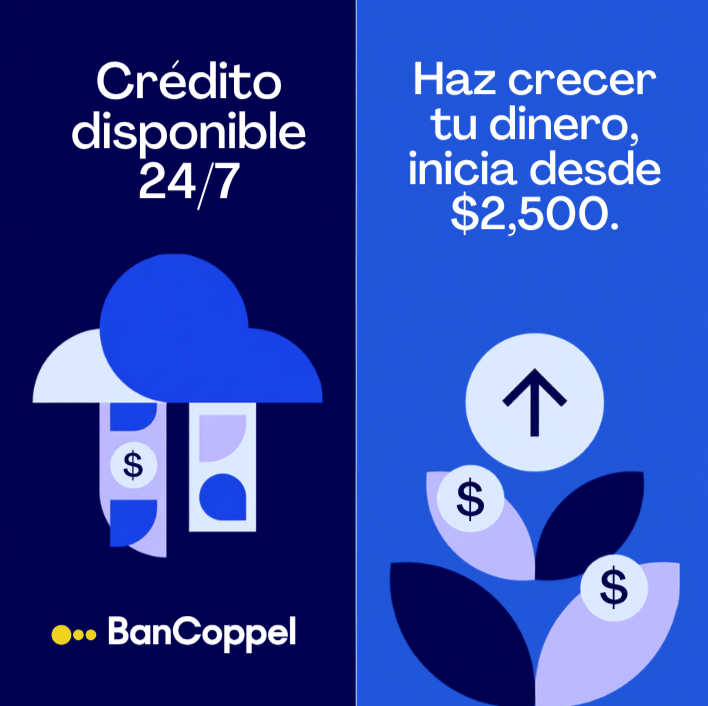
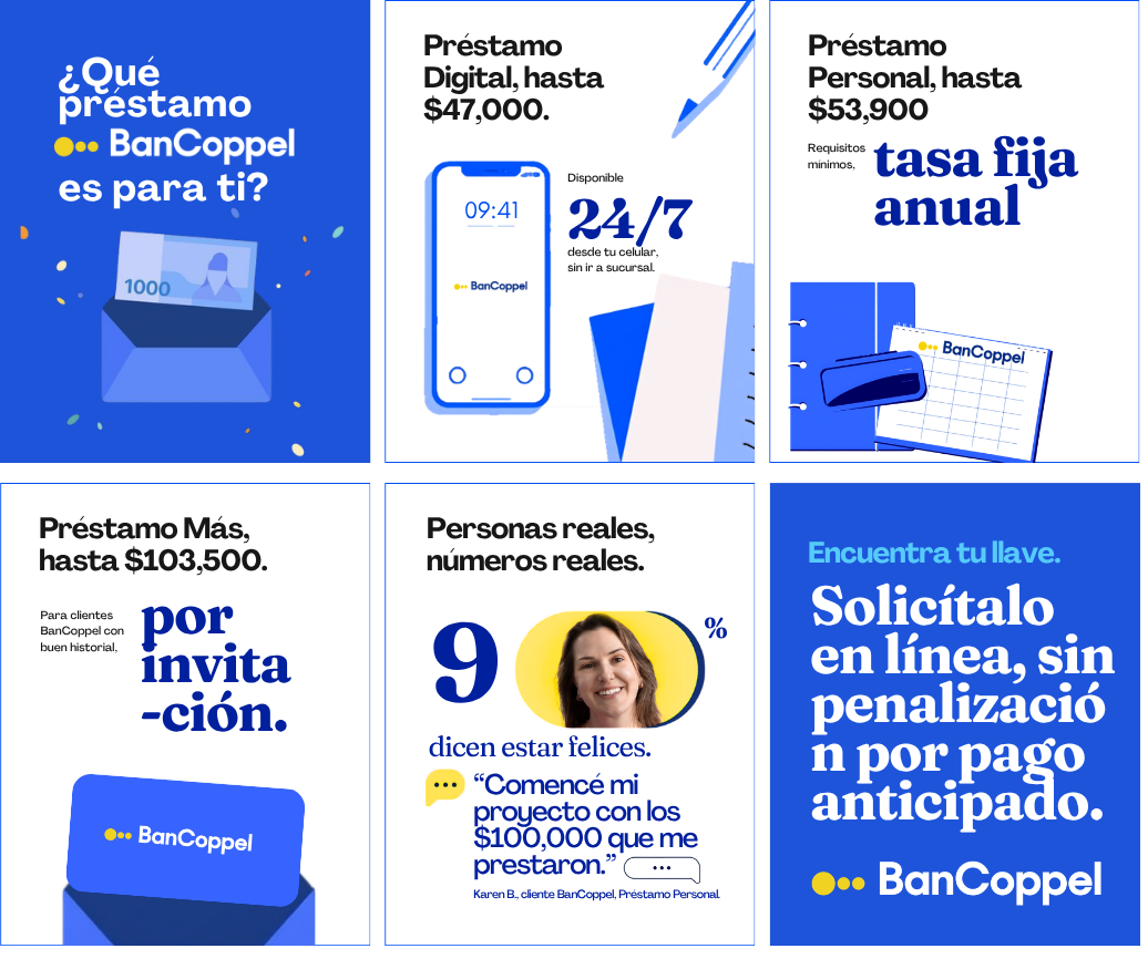
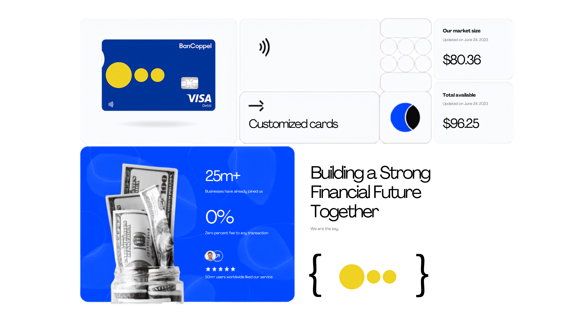
BanCoppel had a real content problem: almost nothing in market was built data first. Product terms, rates, amounts, timing, existed only in dense legal tables, never translated into a format a first time borrower could actually use to compare options, so the fix was not new copy, it was new structure. The bank is a giant in northern Mexico, but everywhere else, applying for a card still carried a quiet sense of embarrassment.
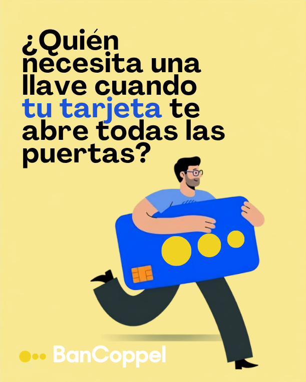
The timing turned out to be perfect. In June 2025, Grupo Coppel relaunched its entire visual identity around the campaign "Tú eres la llave," modernizing its historic key symbol into something more versatile and contemporary, and reasserting what the key had always meant for the brand: trust, inclusion, social mobility, the ability to build something of your own. That rebrand gave BanCoppel a rare opening, a moment when the parent brand's entire meaning system was already being redefined in public, and BanCoppel could ride that momentum instead of fighting for attention on its own.
I translated that key symbol into three overlapping circles for the BanCoppel content system, each one carrying a layer of the same idea: the key is Coppel, the key is you, the key is your account, the key is BanCoppel. BanCoppel's role in that chain was to be the door itself, the specific product that turns the promise of the key into something you can actually use. Every piece of content had to connect back to one line, BanCoppel opens the door for people to improve their life, tying directly into Coppel's own promise, "Coppel mejora tu vida," instead of existing as a separate financial brand borrowing the parent's name.
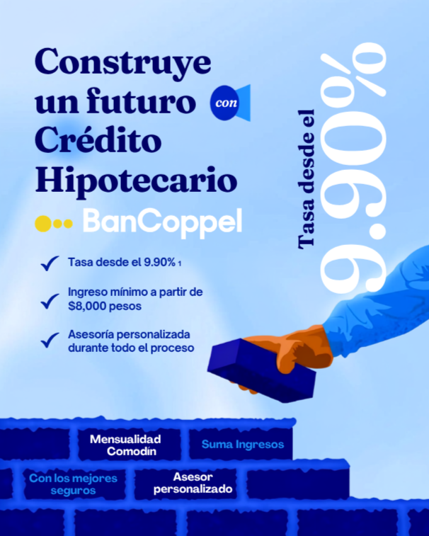
I led that proposal, working alongside a small data and creative pod, writing evergreen content in native social language and structured around SEO copy so it could also work as a discovery channel, not just a brand touchpoint. Each product in the two examples below got a chart type chosen for the specific anxiety it needed to resolve, loan amounts needed comparison, so they became a ladder chart, mortgage timing needed reassurance through speed, so it became a timeline chart, and choosing the chart type before choosing the visuals is the actual skill on display here. The two examples below are recreated concepts in the same strategy I led, since some original production files stayed with the agency when I moved on, applying real BanCoppel product data to show how the data first approach worked in practice.
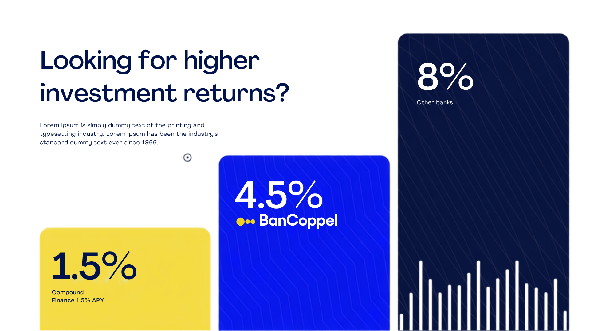
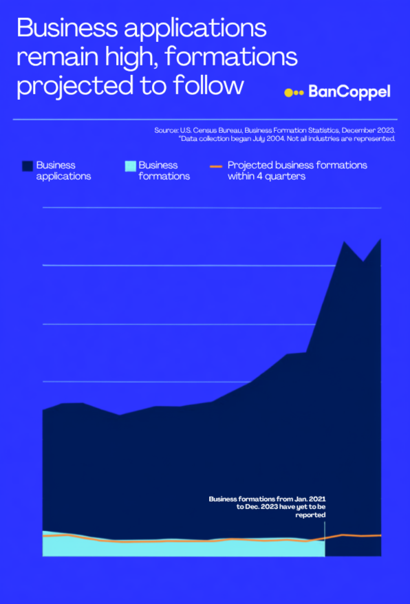
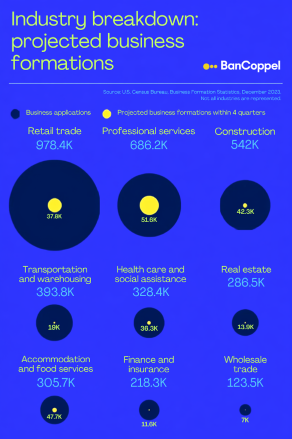
Internal presentation layout
Leading the team also meant reporting back to the people funding it. I regularly designed our internal results presentations myself, taking raw performance numbers, reach, engagement, content output by pillar, and building a layout stakeholders could actually follow in a live meeting, not just skim in a spreadsheet later. That work was less about decoration and more about sequencing: which number opens the presentation, which one needs a chart instead of a table, and which single stat earns its own slide instead of getting buried in a list. Getting that sequencing right for a room full of stakeholders is its own design discipline, and honestly closer to the actual thesis of this whole page than any single campaign is.
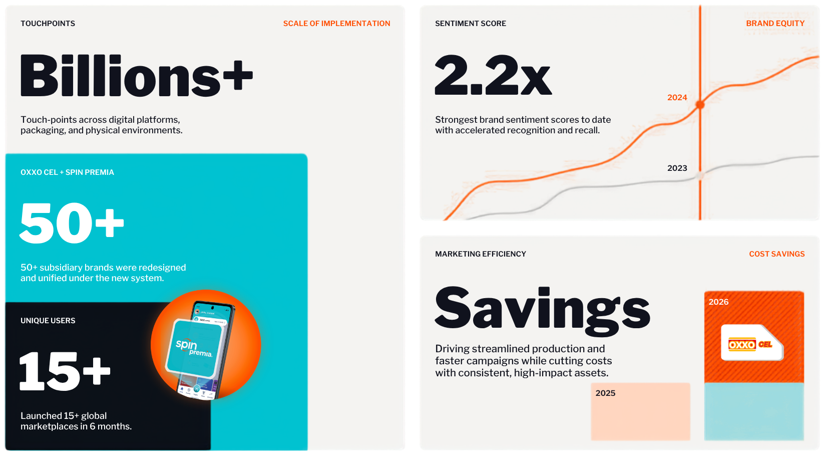
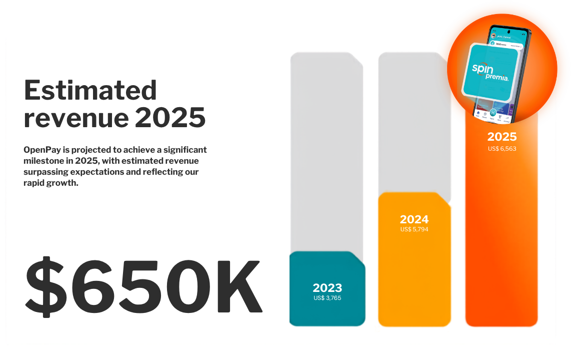
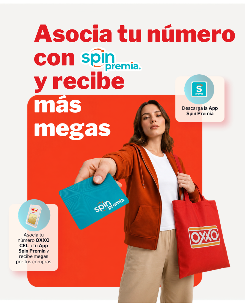
Spin Premia, OXXO Cel launch 2025Spin by OXXO is an ecosystem, a digital account, a loyalty program called Spin Premia, personal credit, bill payment, and now mobile service through OXXO Cel. My work centered on the OXXO Cel launch, and the real challenge was making people understand that all of these pieces connect. Spin by OXXO counts more than 11 million active users, up 22.3 percent year over year, and at that scale, an unclear ecosystem is not a small copy problem, it is millions of users leaving value unclaimed because the connection between spending and rewards was invisible.
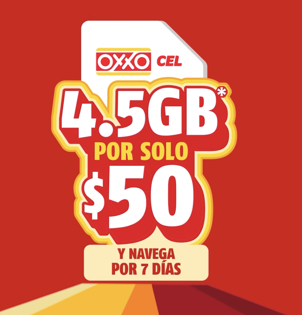
The core mechanic, every transaction inside the Spin ecosystem earns Spin Premia points, and those points convert into mobile data on OXXO Cel, came straight from FEMSA's own launch materials, and it needed a map, not a list, so the content strategy leaned on hub and spoke and flow style diagrams instead of bullet points, treating how the ecosystem connects as a structural design problem first and a copywriting problem second.

Launch campaign 2025DiDi Cuenta's core challenge was trust at a very basic level: convince someone to move real money into a super app wallet. The positioning we landed on, "Cuenta con DiDi," carries a deliberate double meaning in Spanish, open an account, and count on us, so the brand promise is built into the name itself before a single benefit gets explained.
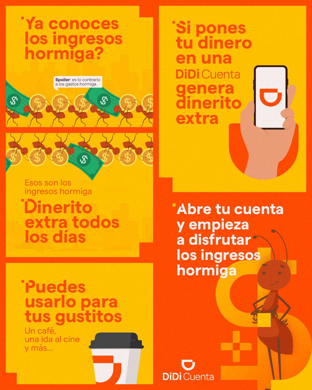
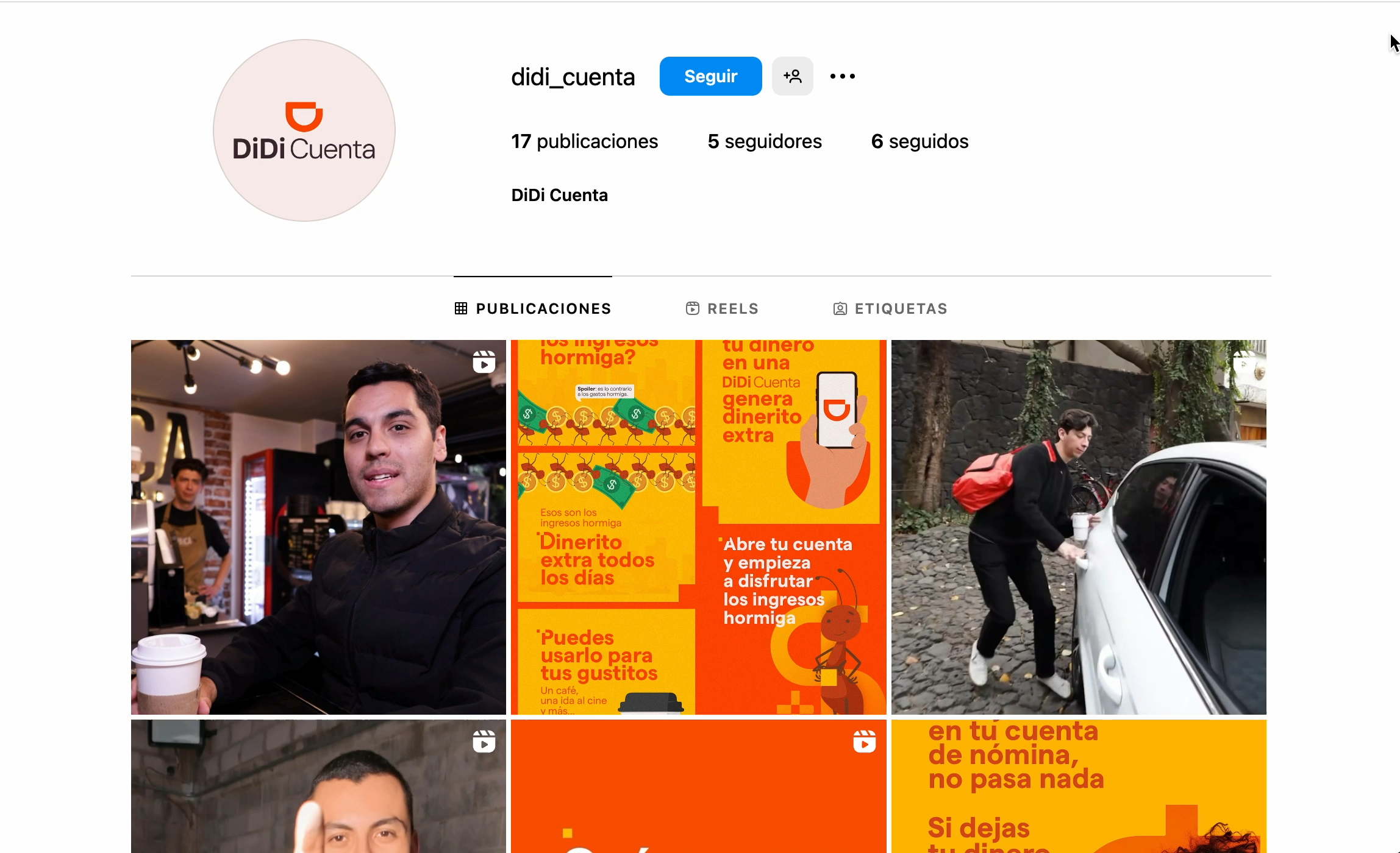
Ingresos Hormiga The strongest single idea to come out of the content strategy was Ingresos Hormiga, built directly on a term most Mexicans already carry around, gastos hormiga. CONDUSEF and INEGI data show these small, easy to ignore daily purchases eat up between 12 and 15 percent of a person's income, roughly 900 to 2,200 pesos a month that most people cannot even account for afterward. DiDi Cuenta's cashback becomes small amounts coming back in, unnoticed, automatically, just by using the account for things you were already going to buy. We carried that same logic into the visual system rather than treating it as a copy trick. The ant motif is a data visualization choice as much as an illustration one, the same logic as a unit chart or isotype chart, the classic technique for showing that many small things add up to one big thing, just built as a character instead of a chart axis so it could work inside a social carousel without a legend. This ran as a real, published carousel on the @didi_cuenta account, using everyday purchases, a coffee, a movie ticket, as the proof of concept.

The Juice Shop The Juice Shop is a recurring content format, not a single post, and it came out of a behavioral finding rather than a statistic: financial education content consistently underperforms the moment it reads like a lecture. So instead of chasing another number, the operating insight was structural, strip the didactic tone out entirely and the same information performs. The idea sets up a juice shop as the physical stage for that education, delivered through a casual conversation with the person behind the counter, walking through taxes, savings, and investment basics in plain language, with creators dropping into scenes "by chance" to add a tip or a personal anecdote about earning a little extra. Translating a dry topic list into a physical space, a shop counter, is itself a visualization decision, the structure carries the message the same way a diagram does work a table cannot.
Extracash Store Extracash Store extends the same cashback logic into a concrete mechanic. Opening a DiDi Cuenta becomes the gateway to a pop up marketplace where the extra money the account generates can be spent on small, specific rewards, gift cards, DiDi ride credit, order perks, merch. That is the visualization choice at the center of the idea: an abstract percentage becomes an inventory of literal, priced items laid out like a store shelf, converting a rate into a catalog a user can scan the way they would scan a price list, which matters more than the rate itself in a category where most people distrust the math.
Social Media
The framework underneath All the ideas map back to three content pillars, The Everyday Extra, The Extra in Your Life, and DiDi's Extra, a system built so every future piece of content could be sorted and justified against one framework instead of improvised tone by tone. We visualized that system as a concentric circle diagram, brand core at the center, audience and properties on the outer ring, doing the same job a nested hierarchy chart does in a data deck, showing scope and priority in one glance, just wearing brand colors instead of a legend.

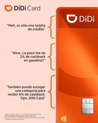
2025DiDi Card is a harder brand problem than DiDi Cuenta, because a credit card is never neutral the way a digital wallet is. Before writing a single piece of content, I ran a netnography study and a conversation clustering analysis on public conversation about credit cards in Mexico, and the split was stark: 46.1 percent traced back to bad past experiences with banks, 36.8 percent was people making jokes about debt and interest rates. We visualized that finding as a horizontal bar chart, one bar per cluster, ranked by size, deliberately the most boring chart type available, because the finding was strong enough on its own that it needed to be read correctly in three seconds by a stakeholder who had never seen the research before, not decorated. That single data point became the whole strategy: meet people with humor and permission, not another lecture about responsible spending.
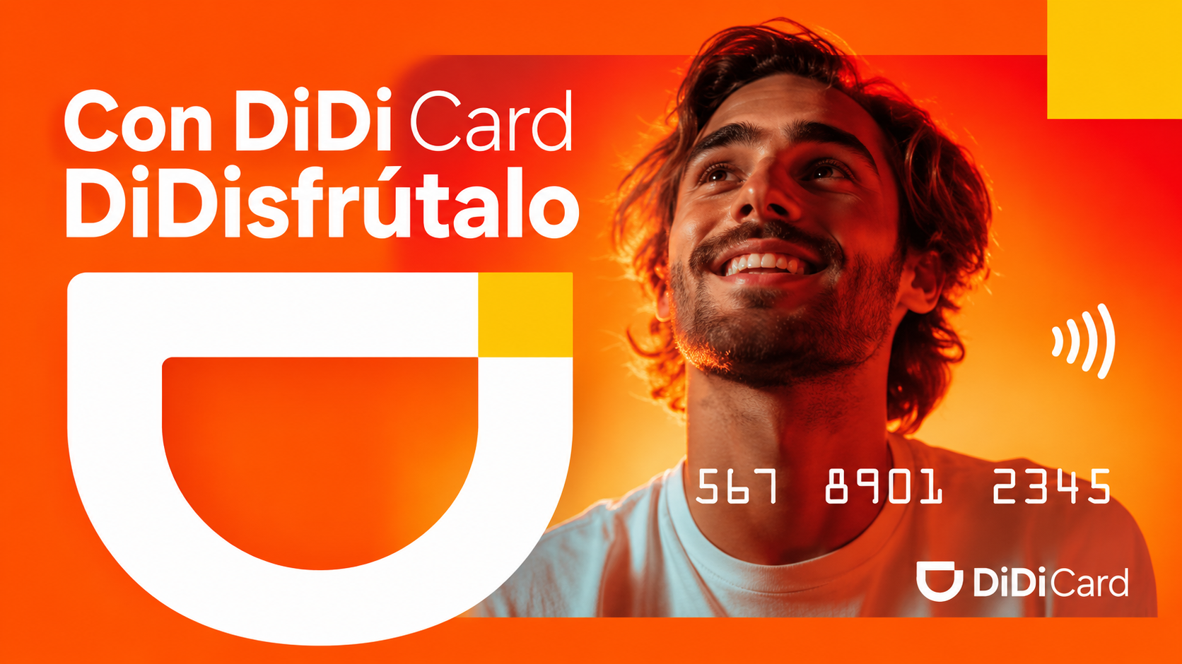
DiDisfruta, the content universe DiDisfruta is not a single campaign or a content pillar, it is the ongoing territory everything else lives inside, and it exists because the research already handed us two territories rather than one. The two dominant conversation clusters split cleanly into spending behavior on one side and bank trust and fear on the other, so we gave each one a line, "DiDisfruta your shopping life with DiDi" for everyday spending without guilt, and "DiDisfruta your credit without fear" for the trust side. Every format under DiDi Card had to sit inside one of these two lanes, each with its own consistent visual system, so a viewer could tell which lane a piece belonged to before reading a word of copy, the same way color coding tells you which series you are looking at on a chart without checking the legend.
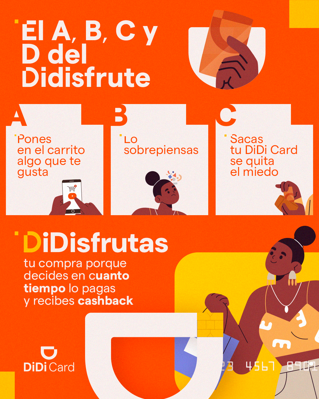
El ABC del Disfrute El ABC del Disfrute, the A, B, C of enjoying it, is a published carousel built on that same hesitation insight, reduced here to three deliberately small, literal steps instead of a character: put the thing in your cart, stop overthinking it, pull out your DiDi Card and the fear goes away. The three panel structure, with the letters A, B, C used as literal step markers, is essentially a decision funnel simplified to three states, the same architecture as a three step conversion funnel chart, just illustrated for social instead of plotted for a deck. It closes on the idea that you get to enjoy the purchase because you decide how long you take to pay it off, and you earn cashback either way.

Pepe DiDisfruta Pepe DiDisfruta introduces a recurring, charismatic character who shows up at the exact moment of hesitation right before a purchase, the pause where guilt or doubt creeps in, to remind the user that DiDi Card removes that friction. He came out of a qualitative finding from the same research phase, the Tension insight, that people describe a felt conflict between planning for the future and enjoying the present, which is not a number you chart, it is a feeling you cast a character to carry. Built as a running character rather than a one off ad, with the same color block and reveal pattern every time he appears, Pepe functions as a visual index. Even without reading copy, a viewer can identify a Pepe DiDisfruta post the same way consistent color coding lets you track one series across a whole report.
Social media
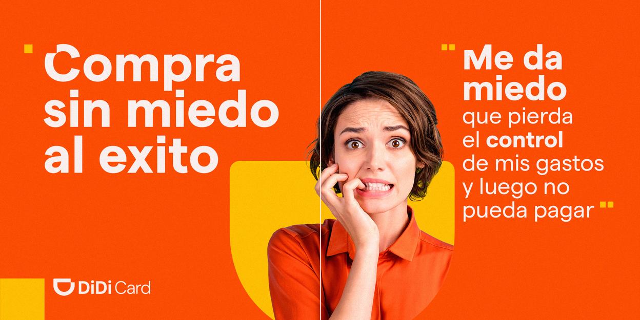
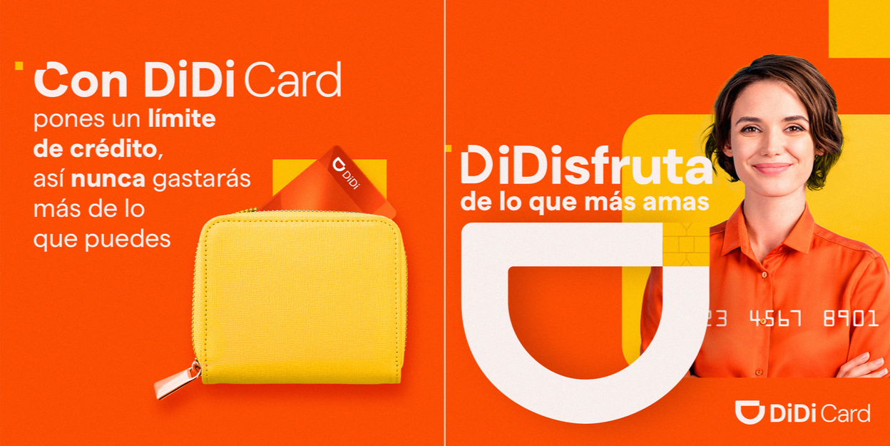
65K mentions, 45.9K unique users reached, 300.7K interactions.2016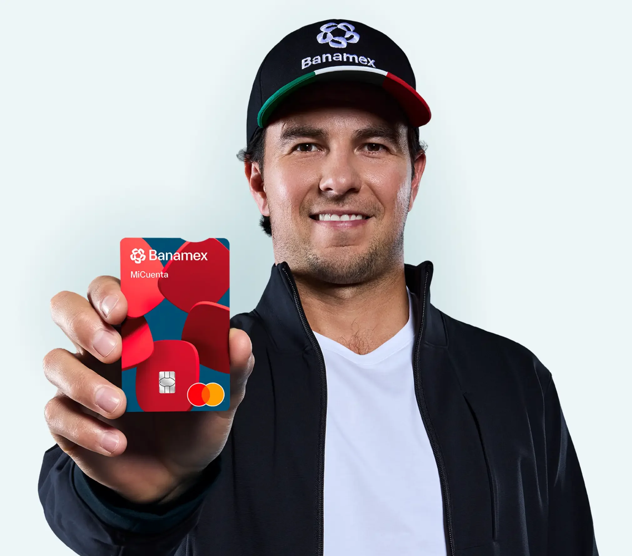

This is where I first learned how print works differently in financial services than anywhere else. I worked on the BTL and point of purchase side of Banamex's Formula 1 sponsorship, the campaign built around the Citibanamex rebrand and the return of the Mexican Grand Prix after more than two decades away from the calendar. The production volume that year was massive and almost entirely physical, life size cardboard totems of Sergio "Checo" Pérez placed at branch entrances nationwide, printed flyers and brochures in the team's livery colors promoting exclusive Grand Prix ticket pre sales, and large teller window posters showing the driver holding his helmet next to the bank's new logo.
The constraint on this project was never a chart, it was regulatory. Every rate, term, and disclaimer legally had to appear on the piece in full, and still read at a glance from across a lobby, which is a different kind of data problem than a dashboard, an information density problem, fitting mandatory disclosure into a layout without the promotional message losing all its visual weight. The solution was a strict hierarchy discipline: the emotional hook, Checo, the car, the moment, always largest and highest contrast, the legally required copy always present but visually subordinate, sized and placed so it reads as complete rather than an afterthought. That is the financial industry's version of data visualization, not a chart on a screen but information architecture under a legal constraint most other industries never have to design around.
(For context: this partnership has resurfaced in 2026, with Banamex bringing Checo Pérez back as brand ambassador in a new campaign. It is a good sign that the trust built by that original branch level work is still worth investing in.)