Tequila Don Ramón
The Insight
In Mexico, true authority does not always look polished.
Sometimes it looks familiar, direct, even underestimated — but it knows exactly what it is talking about.
Because real quality does not need to perform sophistication.
It simply has it.
The Idea
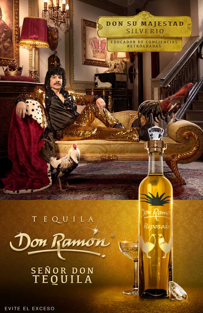
El Señor Don Tequila embraced everything others might have tried to correct.
We turned a bottle that could be perceived as less refined into a symbol of character, honesty, and irreverence.
A “fine” bottle with a tequila of exceptional quality, presented through a campaign that refused to behave like the category.
Not the kind of premium the category expected.The kind people respect.The Challenge
Tequila Don Ramón had to enter a category where almost every brand was speaking the same premium language: elegance, sophistication, heritage, refinement.
The problem was that its bottle design did not immediately fit that world.
Instead of hiding that tension, we decided to use it.
The Approach
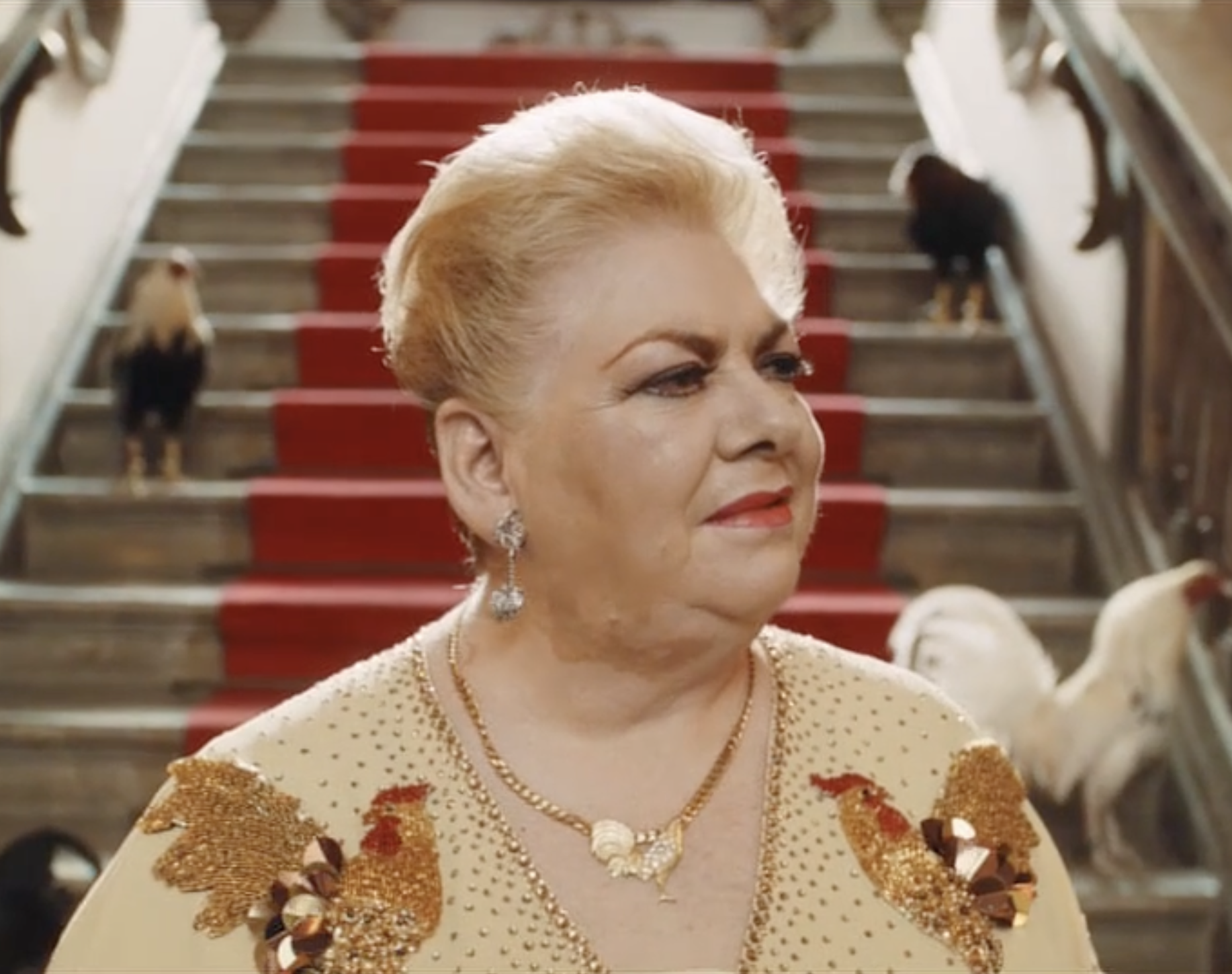
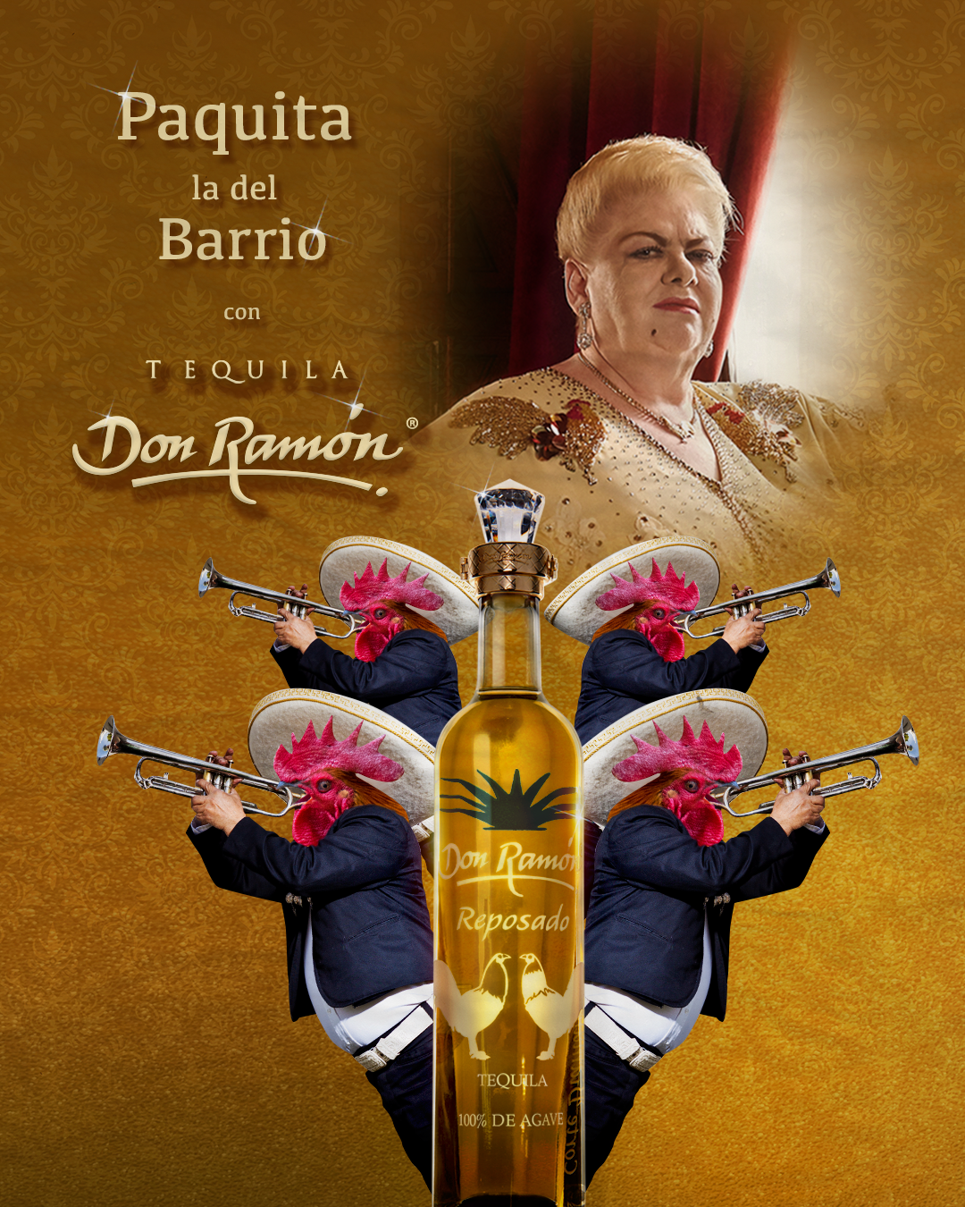
The campaign was built around the cultural codes of Mexico’s dones and doñas: people of the pueblo, but also true professionals in taste, judgment, and presence.
People who may not look conventionally premium, yet carry undeniable authority.
People who know quality when they see it.
And more importantly, when they taste it.
That tension became the soul of the launch:
a tequila that looked unexpected, spoke differently, and owned its place with confidence.
01. Case Study
0.2 Film
Director: Rodrigo García. Production Company: Central Films. Executive Producer: Mauricio Francini & Carolina Kostbahn. Director of Photography: Emilio Valdés.
Client: Tequila Don Ramón Agency: Oveja Negra Mullen Lowe Creative Director: Manuel Escalante Art Director: Mariana Romero
Print.